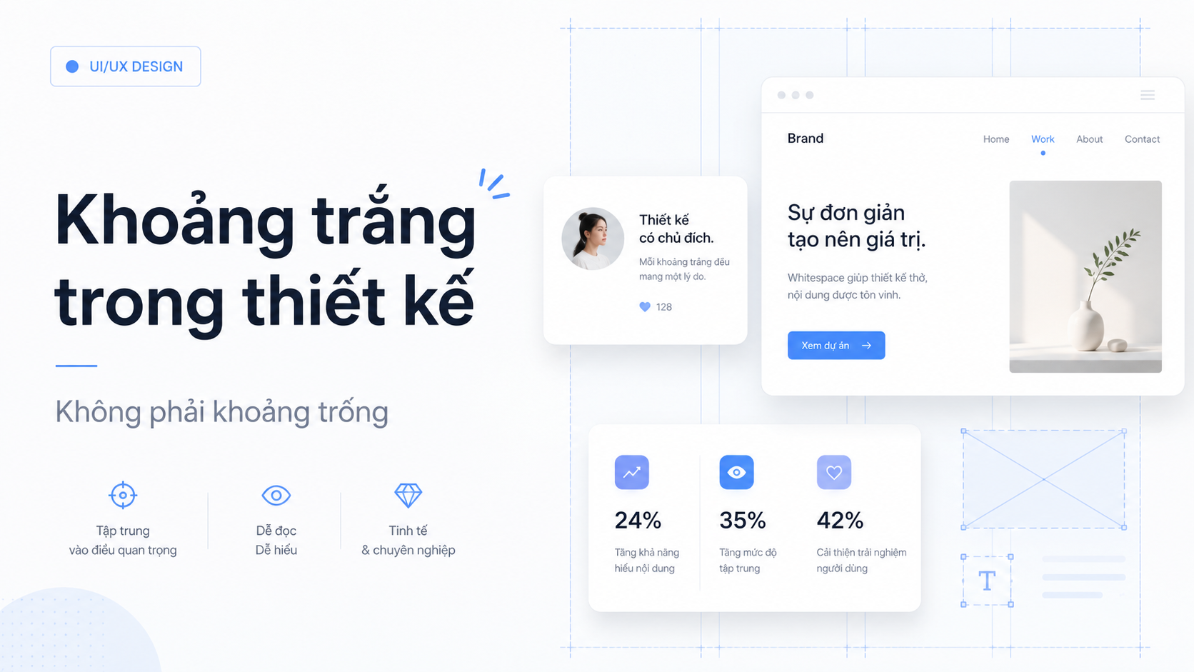
When designing an interface, many people focus heavily on visible elements such as colors, images, typography, buttons, and icons. Meanwhile, the areas without content are easily overlooked.
The space between elements is called white space (or negative space). White space does not necessarily have to be white. It can take on any background color, as long as that area is not filled with content or UI components.
White space is not what is left over after designing. It is an element that must be designed intentionally.
White Space Makes Interfaces Easier to Understand
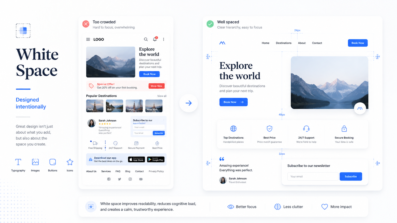
Imagine a screen with a heading, a description, an image, a button, and secondary information. If all these elements are placed right next to each other, users will struggle to determine which content is important and how different parts relate to one another.
White space helps separate content groups and creates a clear visual structure for the screen.
According to the principle of proximity in Gestalt psychology, elements placed close to each other are perceived as related. Conversely, larger spacing indicates that elements belong to different groups. Therefore, simply by adjusting spacing, designers can help users understand the interface structure without adding extra lines or background colors (Harley, 2020).
For example, the distance between a label and its input field should be smaller than the distance between two distinct information groups. Similarly, the space between a heading and its body text should be smaller than the space between two sections.
If every space is identical, users will find it difficult to recognize complete logical groups.
White Space Creates Visual Hierarchy
A good interface should clearly tell users where to look first.
Designers usually establish hierarchy using font size, color, font weight, and contrast. However, white space also plays a massive role in making content stand out.
A Call-to-Action (CTA) placed amidst crowded elements must compete for attention with surrounding content. But when given sufficient breathing room, that same button can stand out immediately—even without an overly loud color.
The same applies to headings, key metrics, or hero images. White space creates a focal point, giving the user’s eyes time to absorb and process the content.
Junior designers often try to emphasize an element by increasing its size or adding bold colors. In many cases, a simpler solution is just adding more space around it.
White Space Improves Readability
A paragraph with a suitable font size can still be difficult to read if the line spacing is too tight. A clearly written list can still feel overwhelming if the items are packed too closely together.
White space in design does not only exist between major sections. It also appears in line height, paragraph spacing, card padding, and the space between an icon and its text label.
These micro-spaces create a visual rhythm for the interface.
When rhythm is maintained consistently, users can read and scan content more naturally. In contrast, inconsistent spacing makes an interface feel fragmented, even if the colors and typography were well-chosen.
Heavy Content Does Not Mean a Crowded Design
A common challenge when designing dashboards or management systems is that clients often want to display a vast amount of information on a single screen.
In such cases, the solution is rarely to reduce padding and shrink everything just to make it fit on the screen.
Designers need to identify which information must be visible immediately, which content can live in other tabs, and which elements only need to appear upon interaction. Related content should be grouped together, while distinct groups require clear separation.
A screen packed with data can still be easy to use if the information architecture is clear. On the other hand, a screen with only a few elements can still feel cluttered if the spacing is poorly handled.
More White Space Does Not Guarantee Better UX
While white space is valuable, more is not always better.
If the distance between related elements is too large, users may fail to realize their connection. An action button placed too far from its primary content might be completely missed. A screen with excessive space can also force users to scroll excessively or make it harder for them to locate essential tools.
The Nielsen Norman Group points out that removing visual elements can reduce distraction, but if essential tools are hidden, interaction cost and cognitive load may increase. In other words, "less" is not always "better" if minimalism strips away crucial visual cues (Fessenden, 2016).
The goal of white space is not to make the screen look empty. The goal is to make the content easier to comprehend.
How to Use White Space Effectively?
Rather than adding space based on intuition, designers should establish a consistent spacing system. Spacing values should reflect the degree of relationship between elements.
- Small spacing: Ideal for elements within the same functional group, such as an icon and its label.
- Medium spacing: Suitable for separating components within a card.
- Large spacing: Reserved for separating different sections or major functional blocks.
When reviewing a screen, ask these three questions:
- Can users recognize content groups without reading the text?
- Does the primary action have enough breathing room to stand out?
- Are any elements separated too far from their related content?
By simply answering these questions, designers can catch a majority of layout issues.
Conclusion
White space is an active part of the content, not something outside of it.
It builds hierarchy, expresses relationships, improves readability, and guides user attention. However, just like color or typography, white space is only effective when used with clear intent.
A great interface is not one filled in every possible spot. Nor is it one with the maximum amount of empty space.
It is an interface with just enough space for every element to play its role effectively.
References
- Fessenden, T. (2016, December 18). Why zen mode isn’t the answer to everything. Nielsen Norman Group. https://www.nngroup.com/articles/zen-mode/
- Harley, A. (2020, August 2). Proximity principle in visual design. Nielsen Norman Group. https://www.nngroup.com/articles/gestalt-proximity/