Introduction: testing is more than clicking through a script
Many people outside the industry picture a tester's job as opening a pre-written test case and clicking through the buttons in order. That is only the surface of the work. When a product ships and users hit trouble, the tester is the first person asked: how did this bug slip through?
I wrote this after several years of QA work across fintech, e-commerce, and SaaS. The twelve lessons below are not textbook theory. I paid for them with time, tense arguments, and apologies to customers.
Program testing can be used to show the presence of bugs, but never to show their absence.
Edsger W. Dijkstra, Notes on Structured Programming, 1970
The twelve lessons at a glance
| # | Lesson | One-line takeaway |
|---|---|---|
| 1 | Ask, do not guess | Every ambiguity in the spec becomes a question, not an assumption. |
| 2 | Happy path first | Half your time goes to the flow most users actually take. |
| 3 | Two layers of sight | Feel the journey as a user, then inspect it as an engineer. |
| 4 | Four data states | Empty, loading, overload, error. Never just the pretty case. |
| 5 | Suggest improvements | Do not stop at a deviation; propose a concrete fix. |
| 6 | Severity vs priority | Technical impact and business urgency are different axes. |
| 7 | Evidence, not emotion | A bug report is a forensic record, not a complaint. |
| 8 | Open F12 first | No request means frontend; 500 or timeout means backend. |
| 9 | Database is truth | A green banner is not proof that the data is correct. |
| 10 | Butterfly effect | Retest every flow that shares the code you changed. |
| 11 | Users are messy | Double clicks, back buttons, pasted text, long names. |
| 12 | Developers are allies | Put both of you on the same side of the problem. |
Part 1: Thinking about business requirements
Lesson 1: Read the spec to ask questions, not to guess
The trap: Skimming the document and filling every gap with personal intuition, because asking feels like bothering the BA or the developers.
- Read with a pen and underline every ambiguity.
- Ask what-if questions: What if the network drops mid-payment? What if the user cancels at the last step? What if two people pay the same order at once?
- Turn every answer into an explicit test criterion.
Takeaway: A syntax error costs minutes. A misunderstood requirement costs hundreds of hours.
Lesson 2: Protect the happy path before hunting for edge cases
The trap: Rushing into exotic edge cases on a new build while the core registration or payment flow is still broken.
- Spend about 50 percent of the time on the happy path most users take.
- Spend about 30 percent on common input errors.
- Spend the last 20 percent on extreme and boundary cases.
Takeaway: Nobody tests 100 percent of every case. Prioritise the flows where a small bug costs money or trust.
Part 2: The experience lens
Lesson 3: Two layers of sight, from user feeling to a technical magnifying glass
The trap: Two wrong extremes. One is chasing pixel misalignment and missing how the journey feels. The other is clicking through without noticing the layout breaking at other screen sizes.
- First five minutes: play a new customer in a hurry, mouse only.
- Then open the responsive tool and inspect buttons, spacing, and visual priority at each width.
Takeaway: Feel the product as a user, then inspect it as an engineer.
Lesson 4: Think in four data states
The trap: Testing only with pretty sample data and forgetting the first-run, slow-network, heavy-data, and failure experiences.
- Empty: an illustration, a short explanation, and a create button.
- Loading: disable the button and show an inline loader to stop double clicks.
- Overload: test 100-plus character names, very long lists, and missing optional fields.
- Error: explain what happened and how to recover.
Takeaway: Four states are the minimum bar for any screen.
Lesson 5: Do not stop at finding bugs, contribute improvements
The trap: Letting a clunky feature pass with the excuse that the spec said so.
- Record an improvement suggestion with a concrete solution, not just a deviation.
- Example: merge two address fields and auto-fill from the postal code, instead of writing that the form is clunky.
Takeaway: Proposals with solutions get heard.
A bug report is a forensic record, not a complaint.
Part 3: Catching bugs with objective evidence
Lesson 6: Separate severity and priority clearly
The trap: Marking every bug as urgent, which creates tension and hides the bugs that really are serious.
- Severity measures technical impact: a crash, data loss, a broken core feature.
- Priority measures business urgency: a wrong logo does not crash the site, but it must be fixed at once.
Takeaway: Two independent axes. When everything is red, nothing is.
Lesson 7: Speak with objective evidence, not emotion
The trap: Reporting that the screen sometimes breaks or that the interface is slow.
- Numbered reproduction steps.
- Actual result next to expected result.
- An annotated screenshot or video.
- HTTP status and trace ID from the Network tab.
Takeaway: Enough evidence turns half a day of investigation into a five-minute fix.
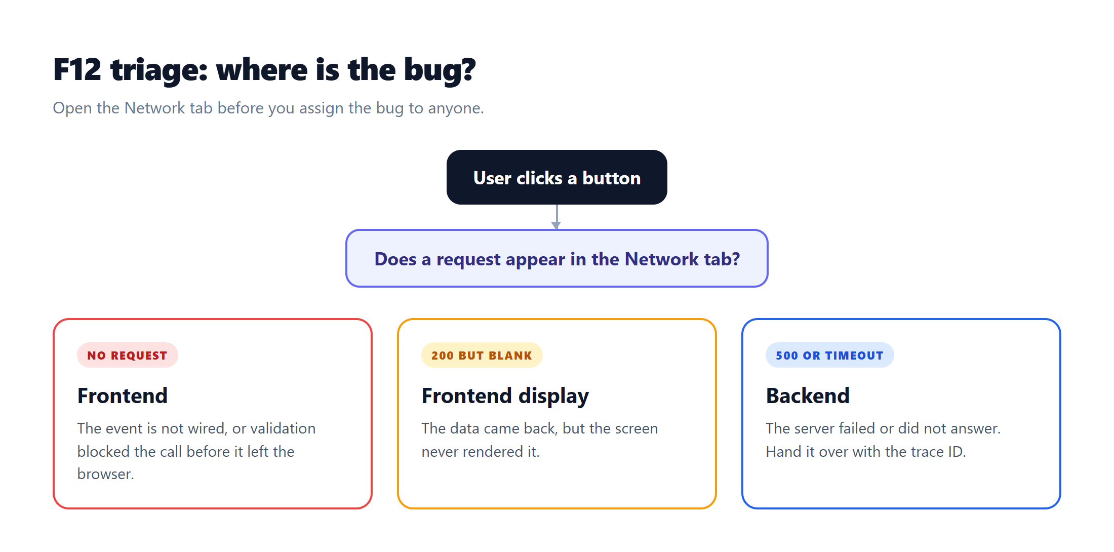
Lesson 8: Open F12 before reporting, and tell Frontend from Backend
The trap: Blaming the backend before checking whether the interface even sent a request.
- No request after a click: frontend, likely a missing handler or blocked validation.
- 200 but nothing rendered: frontend display bug.
- 500 or timeout: backend bug.
Takeaway: Three branches save the team many round trips.
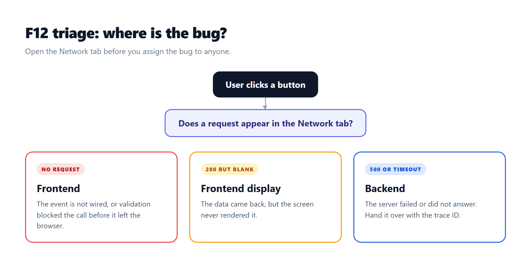
Figure 1. Triage the bug in the Network tab before assigning it.
Lesson 9: The interface is only a shell, the database is the truth
The trap: Seeing a success message and marking the case as passed.
- Query the record directly by ID.
- Check secondary fields, timezone, and change history.
- For payments, permissions, and system settings, database verification is mandatory.
Takeaway: A green banner is not proof. A correct row in the database is.
A green banner is not proof. A correct row in the database is.
Part 4: Systems thinking and empathy
Lesson 10: The butterfly effect, fix one place and another may break
The trap: Checking only the field the developer fixed and closing the ticket.
- Retest every flow that shares the component, validation, or service layer you touched.
- Treat regression as part of the fix, not an extra step.
Takeaway: One shared function can break three screens.
Lesson 11: Real users never operate as neatly as the script
The trap: Testing slowly and sequentially, then assuming users will behave the same way.
- Press confirm repeatedly and check for duplicate orders.
- Hit the browser back button in the middle of checkout.
- Type complex diacritics, paste from Word, and upload files with long names.
Takeaway: Untidy actions expose the bugs a tidy script never touches.
Lesson 12: Do not turn developers into opponents
The trap: A nitpicking attitude that turns the developer into an opponent.
- Replace "your code is broken" with "when I send this data, the system responds like this; could you take a look?"
- Put both of you on the same side of the problem.
Takeaway: Respect and technical empathy make work flow faster than any tool.
Appendix: three practical tools
Tool 1: The forensic bug report template
A standard bug report has five parts. The title follows the pattern of module, frequency of 100 percent or random, and the incident under the trigger condition.
- Test environment: device and OS, browser and version, environment and build number, and the test account with its role.
- Minimal reproduction steps: numbered and short enough for anyone to repeat exactly.
- Actual result: what happened, the waiting time, and the message shown, verbatim.
- Expected result: the correct behaviour under the business rules, including inline validation and a disabled Save button after the first click.
- Technical evidence: an outlined screenshot or video, the request URL, HTTP status, response time, request payload, response body, and trace ID.
Tool 2: The severity and priority matrix
The risk score is the severity weight multiplied by the priority weight. It gives the team an objective order for fixes.
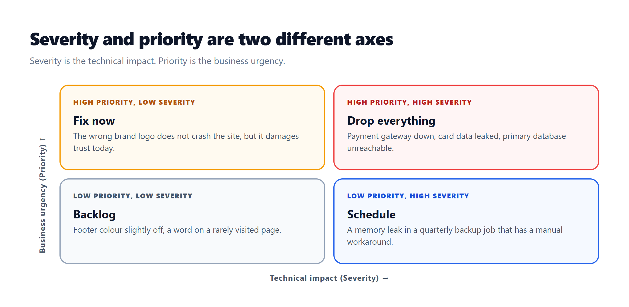
Figure 2. Severity measures technical impact; priority measures business urgency.
| Level | Severity 1: Catastrophic | Severity 2: Major | Severity 3: Moderate | Severity 4: Minor or cosmetic |
|---|---|---|---|---|
| Priority 1: Urgent, fix within 2 to 4 hours | Payment gateway down, card data leaked, primary database connection lost. | Discount codes fail during a flash sale, verification emails are not delivered. | A major partner's logo is wrong on the home page, the brand name is misspelled in a press release. | The app icon is misaligned on a press event build. |
| Priority 2: High, fix in the current sprint | The accounting tax report has a calculation bug that can be worked around manually for now. | Date filters are off by timezone for a group of sub-accounts. | The notification panel close button is misaligned on iPad Safari. | The contact page heading font is 2px off from the design system. |
| Priority 3: Normal, add to the backlog | A memory leak in the legacy backup job that runs once a quarter. | Profile photos cannot be changed with a webp file. | The side menu has no transition animation. | The footer background is darker than the specified colour. |
| Priority 4: Low, fix when there is spare time | A process conflict in a data export tool scheduled for replacement next month. | Formatting issues in an internal report used by only two IT staff. | A single word on the Terms of Service page that does not affect meaning. | The bottom margin on the 404 page is too wide at 300px. |
Tool 3: The four UI states checklist
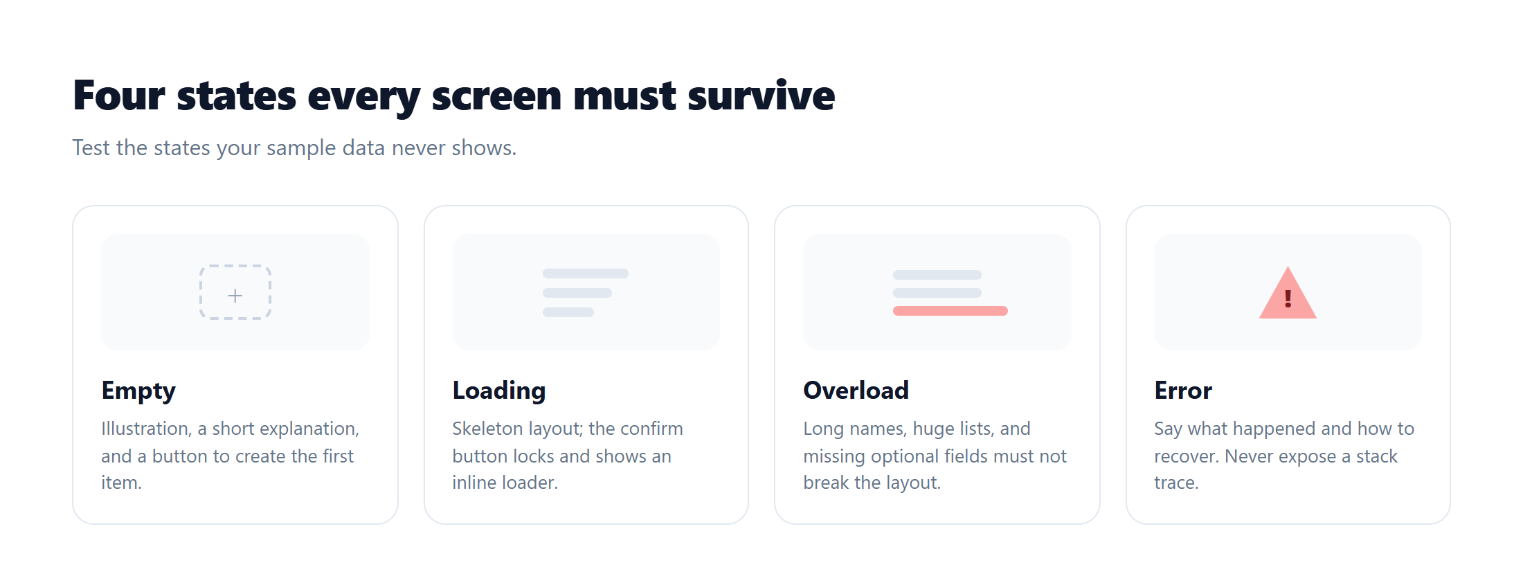
Figure 3. Four states every screen must survive.
1. Empty state.
- ☐ Never leave a blank screen or an unexplained empty table.
- ☐ Show an illustration that fits the context.
- ☐ Add a short heading and a friendly explanation.
- ☐ Provide a primary button that leads to the first item.
2. Loading state.
- ☐ Use a skeleton screen that mirrors the coming layout.
- ☐ Disable the confirm button and show an inline loader.
- ☐ On Slow 3G, the layout must not break after 5 seconds, and long tasks should report progress.
3. Overload and partial data.
- ☐ Paste 500 characters with no spaces; the layout must wrap or truncate with a tooltip.
- ☐ For 1,000 to 10,000 records, use virtual scrolling or pagination.
- ☐ With optional fields missing, the layout stays balanced.
4. Error state.
- ☐ Offline: show a banner and a retry action.
- ☐ 5xx: apologise with a trace ID and never expose a stack trace or database error.
- ☐ Validation: mark the field in red, show the fix below it, and scroll to the first invalid field.
References and further reading
- ISTQB Glossary, terms for severity and priority: glossary.istqb.org
- ISTQB Certified Tester Foundation Level: istqb.org
- Ham Vocke, The Practical Test Pyramid, martinfowler.com: martinfowler.com
- Nielsen Norman Group, empty state interface design: nngroup.com
- MDN, an overview of browser developer tools: developer.mozilla.org
- W3C, Web Content Accessibility Guidelines 2.2: w3.org
- OWASP, Web Security Testing Guide: owasp.org
Closing
Testing is not a race to find the most bugs. It is how the team keeps the user's trust intact. If you take one habit away, take this one: ask before you assume, and check the real data before you trust the banner.