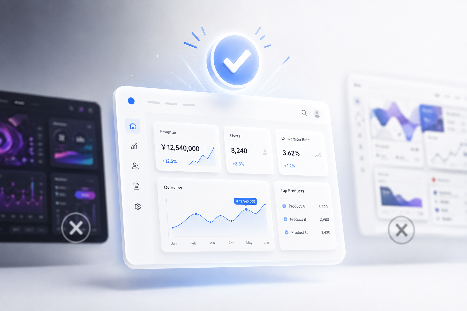
Have you ever poured your heart and soul into creating an incredibly unconventional design, only for the client to nod at a "safe" option on presentation day—one that prioritizes a clean UI and highly legible typography over flashiness?
This sense of disappointment is all too familiar for those in the industry. We easily get caught up in the desire to create interfaces that are striking, eye-catching, and bear our personal mark. So why is there always a mismatch between the designer's expectations and the client's final decision?
The reason is actually quite practical: a gorgeous, art-like design does not necessarily equate to a digital product that drives business results. When viewed through the lens of technical feasibility and real-world user experience, the client's decision to reject the "most beautiful" option is a highly logical move.
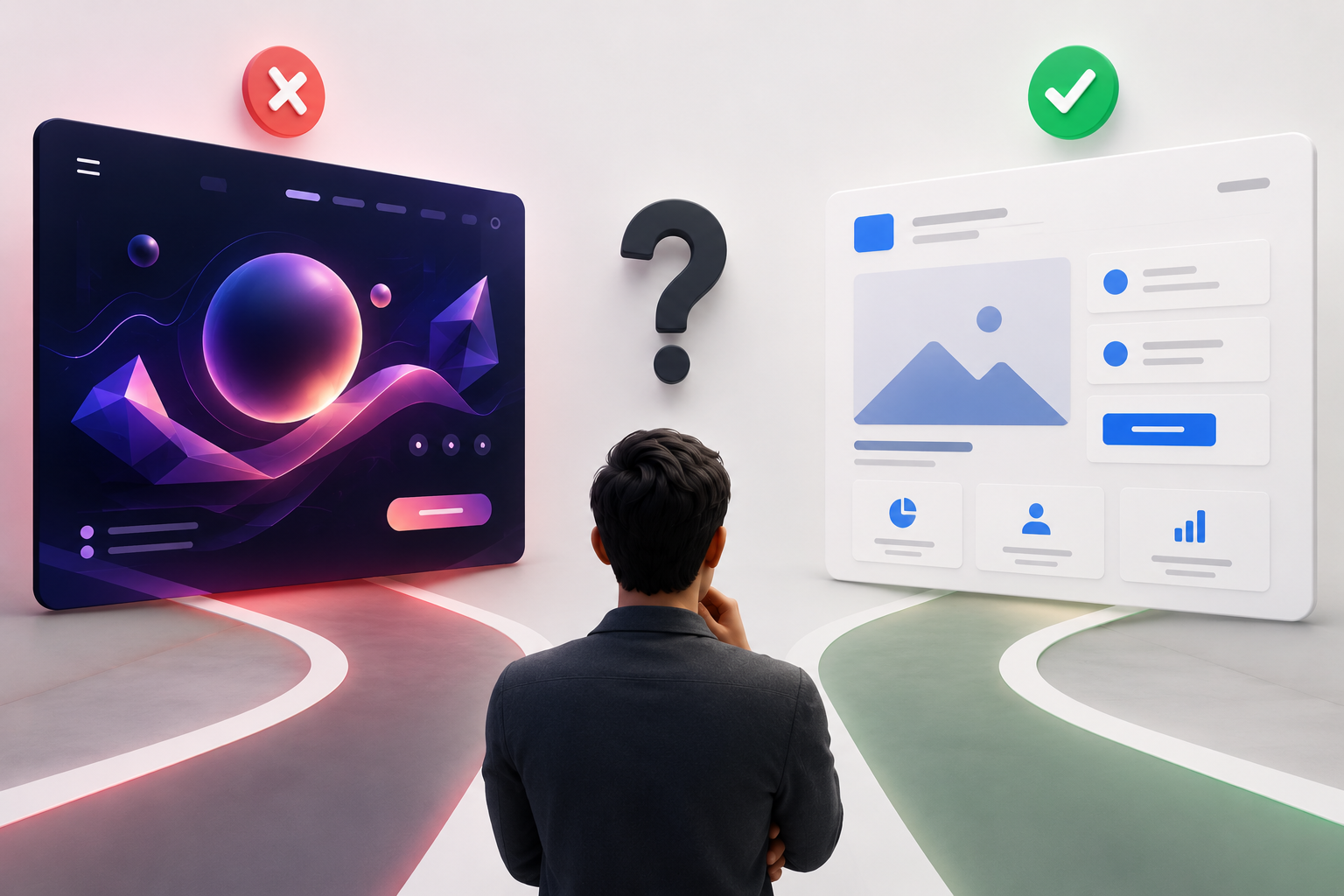
Design Must Solve Root Problems, Not Just Surface Aesthetics
Clients don't hire designers to buy a painting for display; they are looking for a business solution. Their ultimate goal is to increase conversion rates, optimize business workflows, eliminate redundant tasks, or improve user retention. A polished interface with a confusing user flow will fail miserably at generating revenue.
This harsh reality requires designers to move beyond the "receive requirements and draw" mindset. This is where you must apply an ownership mindset. Instead of acting merely as an executor, position yourself as a strategic partner or a technical co-founder. When you proactively dissect and identify the core problems of a business before drafting a design, you realize that efficiency must always precede aesthetics. Clients, especially partners from markets with strict standards, will always choose the solution that proves its ability to solve their exact "pain points," even if its appearance is more modest.
Jakob's Law: Familiarity Breeds Security
Radical creativity can sometimes inadvertently create cognitive friction for end-users. According to Jakob's Law (Yablonski, 2020), users spend most of their time on other websites and applications, so their brains are "programmed" to expect your product to work in the same standard way.
A highly unconventional interface with inverted layouts forces users to expend energy relearning how to navigate. In contrast, a "safe" design prioritizing a Clean UI philosophy offers comfort. For instance, rather than using stylistic but hard-to-read fonts, utilizing typography systems optimized for legibility, with clear visual hierarchies, ensures information is conveyed instantly. Familiarity and transparency build a sense of trust and control—something every business strives to establish with their customers.
Technical Feasibility and the Long-Term Game
A stunning UI with complex animations, multi-dimensional scrolling effects, or 3D rendering might be a visual dream, but it can be a nightmare for the development team and server infrastructure.
- Performance and Load Speed: Heavy graphical elements severely slow down page load times. In an era where users only have 3 seconds of patience, they will bounce before even seeing your dedicated design work.
- Modularity and Scalability: A tech product never stands still. Clients always account for integrating new technologies (like AI or third-party APIs) in the future. A highly specific design rigidly tied to static effects is extremely difficult to componentize or upgrade. They prioritize highly systematic, flexibly modularized designs to keep the system running smoothly and save on maintenance costs.
The Aesthetic-Usability Effect and Its Trap
Many designers lean on the "Aesthetic-Usability Effect" (Moran, 2017)—a psychological principle suggesting that users are more tolerant of minor usability issues if they find an interface visually appealing.
However, reality proves this effect has distinct limits. It only fools users during the "honeymoon phase"—the fleeting initial visual impression. When it comes to actual operation, if the checkout flow throws an incomprehensible error, or the Call-to-Action button blends into an asymmetrical color block, their patience will instantly evaporate. Enterprise clients, who have gained hard-earned experience in the market, are sharp enough not to fall into this "style over substance" trap.
Conclusion
Possessing a beautiful interface is a fantastic competitive advantage, but it is never the sole determining factor for a project's success. To get a client to wholeheartedly approve a design, UI/UX designers must bravely step out of the comfort zone of visual aesthetics.
Start looking at your designs through the lenses of technical feasibility, behavioral psychology, and most importantly, business survival goals. When you harmonize these elements, the solution you bring to the meeting table won't just be the most beautiful one—it will be the right one.
References
- Moran, K. (2017). The Aesthetic-Usability Effect. Nielsen Norman Group. Retrieved from https://www.nngroup.com/articles/aesthetic-usability-effect/
- Nielsen, J. (2012). Usability 101: Introduction to Usability. Nielsen Norman Group. Retrieved from https://www.nngroup.com/articles/usability-101-introduction-to-usability/
- Yablonski, J. (2020). Jakob's Law. Laws of UX. Retrieved from https://lawsofux.com/jakobs-law/