As a product evolves, adding features is almost inevitable. Users want more convenience, the business wants to expand the product’s value, marketing wants to increase engagement, and the product team always has new ideas for improving the experience. But there is an interesting paradox: more features do not necessarily mean a better product. If they are not properly organized and prioritized, every new feature can make the product harder to understand and use.
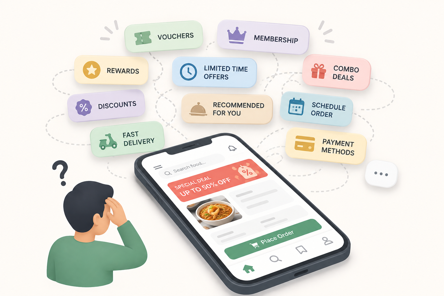
Imagine a food delivery app. At first, users only need to find a dish, add it to their cart, and pay. Over time, the product adds vouchers, reward points, membership, combo deals, food recommendations, time-based promotions, multiple payment methods, express delivery, pre-orders, and so on. All of these features have a reason to exist. But when they all appear on the same screen, users are no longer just thinking, “What do I want to eat?” They also have to process many other choices before completing what should be a simple task.
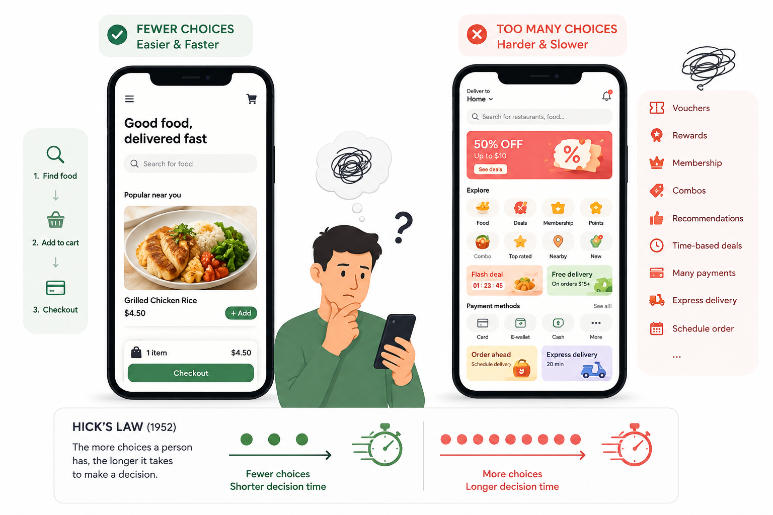
This is one of the issues explained by Hick’s Law. Hick’s research (1952) showed that reaction time tends to increase as the number of choices increases. In product design, this principle is often understood simply as: when users have to choose between too many options, the decision-making process becomes more difficult.
However, the problem is not that “having many features is bad.” A banking system, enterprise management software, or tool for designers will certainly need many functions. What matters is whether users need to see and process all of those functions at the same time.
This is where Information Architecture and experience organization become important. A product can contain hundreds of features and still be easy to use if users are presented only with the choices relevant to their current goal. Advanced or less frequently used functions can be placed deeper in the experience instead of appearing directly on the main screen. This approach is often called Progressive Disclosure: providing only the information or actions users need at the moment they need them, rather than exposing the full capabilities of the system all at once.
Another issue is choice overload – too many choices can make it difficult for users to make a decision. The well-known study by Iyengar and Lepper (2000) found that, in some contexts, people who were given fewer choices were more likely to make a decision and felt more satisfied with their choice than those who were presented with too many options.
This also happens frequently in digital products. A feature can be very useful without necessarily needing to appear on the main screen. A function may be important to power users but completely unnecessary for new users. Therefore, a designer’s question should not only be “What features are missing from the product?”, but also “Which features does the user need at this moment?”
I think this is also one of the most difficult aspects of UI/UX work. When asked to “add a feature,” designing another screen is often easier than questioning whether the feature is actually necessary. But if every request is added directly to the product, the interface will become increasingly complex, user flows will become longer, and users will have to make more decisions.
Therefore, designers are not only responsible for adding. Designers also need to know how to prioritize, group, hide, and sometimes remove.
A good product is not necessarily the product with the most features. It is the product that helps users quickly find and accomplish what they actually need.
Sometimes, good design is not about adding another button.
It is about knowing which button does not need to appear.
References
Hick, W. E. (1952). On the rate of gain of information. Quarterly Journal of Experimental Psychology, 4(1), 11–26. https://doi.org/10.1080/17470215208416600
Iyengar, S. S., & Lepper, M. R. (2000). When choice is demotivating: Can one desire too much of a good thing? Journal of Personality and Social Psychology, 79(6), 995–1006. https://doi.org/10.1037/0022-3514.79.6.995
Nielsen, J. (2006, December 3). Progressive disclosure. Nielsen Norman Group. https://www.nngroup.com/articles/progressive-disclosure/